Cycling Behaviour Dashboard
Purpose of the Dashboard
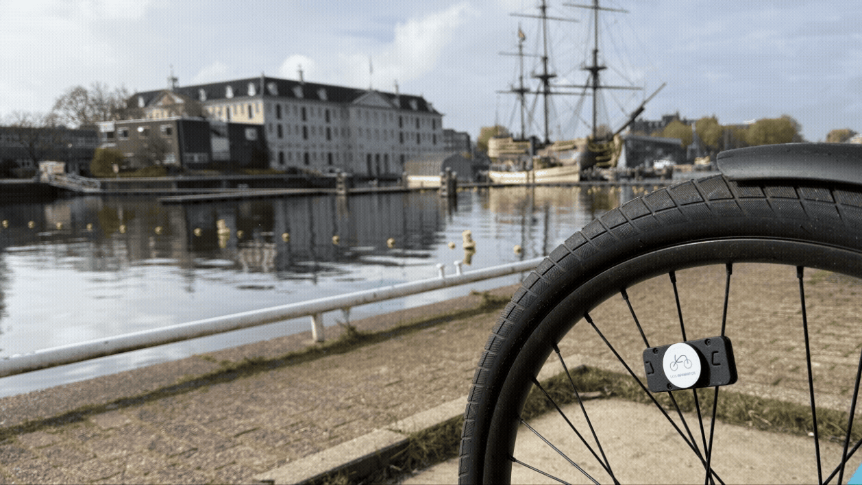
This dashboard is designed for officials and urban planners within the Municipality of Amsterdam to demonstrate the potential of cycling-behaviour-informed policy planning.
It combines self-collected cycling sensor data (speed and road quality) with aggregated road segment analysis.
How to Read the Map
The map visualises Amsterdam's cycling network using selectable data layers. Each layer has its own scale, legend, and policy interpretation.
Available Data Layers
Speed
Displays average cycling speed across recorded trips, supporting the identification of slow or fast corridors.
Road Quality
Based on third-party infrastructure data, categorised from "Perfect" to "No road", supporting infrastructure assessment and maintenance planning.
Averaged Road Segments
Aggregates speed and road quality into averaged scores per road segment, supporting corridor-level analysis.
Composite Score (Quality + Speed)
Within the averaged road segments, you'll see a subfilter which combines infrastructure condition and cycling performance into a single indicator for comparative assessment.
Sudden Braking
Flags locations where a cyclist decelerated suddenly, accumulated across all recorded trips. Braking is detected when a cyclist decelerates at more than 2 km/h per second— meaning speed drops by at least 2 km/h within a single one-second GPS interval. This threshold was adjusted so as to distinguish genuine sudden braking (e.g. at intersections, obstacles, or unsafe road conditions) from normal slowdowns.
Using Filters and Interpretations
Filters can be activated individually or in combination. Each combination reflects a deliberate analytical perspective chosen by the user.
The dashboard does not prescribe a single interpretation, but supports exploratory, policy-driven analysis.
Responsible Use
Behavioural indicators should be understood as signals rather than definitive diagnoses. Results should be interpreted alongside contextual knowledge of street design, traffic conditions, and policy objectives.
🏆 Sensor Leaderboard
Bike Routes